Project Details
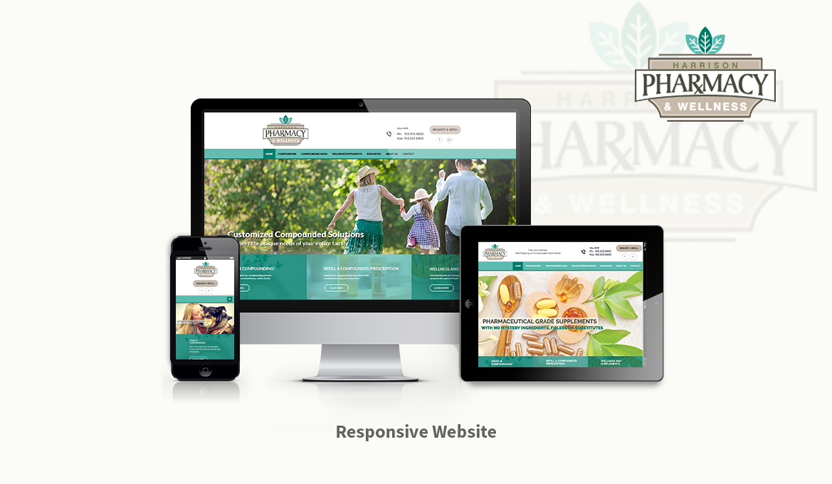
Harrison Pharmacy came to us with a vision of a website that featured their main business entities - compounding, retail pharmacy, and wellness/supplements. They wanted something different than the typical blue and white pharmacy website.
Using colors and elements sampled from their logo, I designed a completely mobile responsive website that was unique, bright, and focused on the most important services offered at their pharmacy. Although most of the images used are stock photos, I carefully selected photos that matched their theme and overall goal as a pharmacy. The end product was a website that the client was ecstatic about and a major upgrade over the stock website they previously had.

